Layout that doesn't look like Word
Six rules that make a yearbook look designed rather than shoved together — without a design degree and without expensive software.
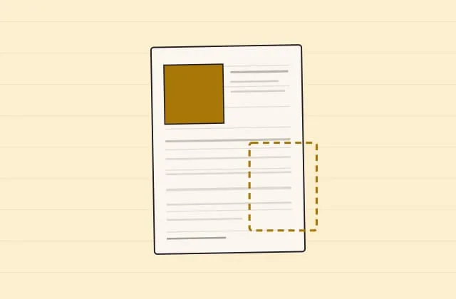
You can tell instantly, even without knowing why: this yearbook looks designed, that one looks shoved together. The difference is rarely talent or software. It is six decisions you make once and then stick to.
1. Two typefaces. Not three, not seven.
The most common giveaway of amateur layout: every page has a different typeface, because every person picked their favourite.
Take two:
- one for headings — it may have character, even something unusual
- one for body text — calm, readable; boring is right here
Everything else comes out of size and weight, not out of a new typeface. Bold, bigger, letter-spaced — that’s enough to build any hierarchy a book needs.
A typeface that changes every other page turns a book into a collection of loose sheets. Fix the two once and write them into the committee document, so every free page knows them.
2. One grid, and then you stay inside it
Take a fixed number of columns (2 or 3 at A5) and align everything to it: image edges, text blocks, headings. Even when there is only one image on the page, it starts at a column edge.
The effect is surprisingly strong, because the eye compares edges. Two images that start 3 mm apart look like an accident. Two images on the same edge look like intent.
A quick test: hold a ruler vertically against a finished spread. If several elements start on the same line, it’s right. If each one starts slightly differently, that’s exactly the problem.
3. White space is not wasted space
The reflex with a half-empty page is to fill it. That is the reflex that ruins layout. A photo with air around it feels bigger than one touching the edge — and a page with three elements feels more expensive than one with eight.
Concretely:
- Text blocks end before the margin, not at it. Reckon with at least ~15 mm of air at A5.
- Between an image and its caption, a small and always identical gap.
- Don’t balance out every leftover space with an extra photo.
If a page feels too empty, usually there isn’t too little on it — what’s there is too small.
4. One element per page is the biggest
Every page needs something that catches the eye first: a big photo, a big number, a big heading. If everything is the same size, the eye doesn’t know where to start — and the page feels restless even though nothing is wrong.
Practical rule: the largest element is at least twice as big as the second largest. Half-differences look accidental; clear ones look decided.
5. Colours: three, and that’s it
Take one main colour (usually from the motto), one accent colour and black/grey. That’s enough for a whole book.
What ruins colour:
- Every section in a different colour. Looks like a craft kit, not a book. Use the same colour at different lightnesses instead.
- Coloured body text. Grey or coloured text on a coloured ground is hard to read at 9 pt in print — and in print it is always lower in contrast than on a screen.
- Four colours, because four people had a say. That isn’t a design question but an organisational one: one person decides.
6. Repetition is the whole secret
What makes a book a book isn’t creativity per page, it’s consistency across pages. All profiles built the same way. Page numbers always in the same place. Chapter titles always the same size. Captions always in the same style.
That sounds like boredom and is the opposite: evenness in the framework is exactly what makes the individual free pages land. If everything surprises, nothing surprises any more.
The practical way there
You don’t have to enforce these six points by hand. In AbiHive you build the book out of templates: profiles, quotes and rankings flow automatically into a layout that is identical for every entry — so point 6 comes free. Typefaces, grid and colour are fixed per template, so 90 profiles aren’t 90 design decisions but one.
Where you genuinely design freely is the free pages. There’s an editor for that with grids and automatic text fitting, so a text that’s too long doesn’t run out of its box. Ideas and examples: Designing free pages.
And because by far the most common layout problem isn’t design but volume: decide the page count early. A layout for 100 pages is a different one from 140. Design first and then discover that 20 pages are too many, and you design twice.
The five most common mistakes in one line each
- More than two typefaces.
- Nothing lines up, because there is no grid.
- Every surface filled, no white space.
- Everything the same size, nothing to catch the eye.
- A new idea on every page instead of one continuous framework.
Takeaways
- Two typefaces, three colours, one grid — decide once, then see it through.
- The largest element twice the size of the second largest.
- White space is design, not emptiness.
- Consistency in the framework, freedom only on the free pages.
- One person decides on typeface and colour. Not four.
After that comes the part that’s meant to find the mistakes: Proofreading — the process that actually holds.
More from Craft
Handing over print files properly: bleed, resolution, colour space
The three terms every print handover hangs on — explained plainly, with the concrete numbers a printer wants to hear from you.
Good leavers' photos without a photographer
Light, background, resolution: how to get photos from phone cameras that look good in the printed book — and which pictures you shouldn't collect at all.
Proofreading: the process that actually holds
Two rounds, fixed roles, one log — how to find the mistakes you can't correct after printing. With a checklist.